Vistar, using illustration to tell their story
I've long been a believer that custom assets such as icons, photography or illustration are the only things that set apart one brand's website from another. Particularly nowadays, when it's relatively easy to create a great responsive online experience.
For me, the thing that can make a brand stand out most, even more so than the company logo, colour scheme, or typography choices (which are all important too, of course) are these assets. In the case of my work with Vistar Media, they came in the form of a set of detailed circular illustrations.
 See all of the illustrations together here.
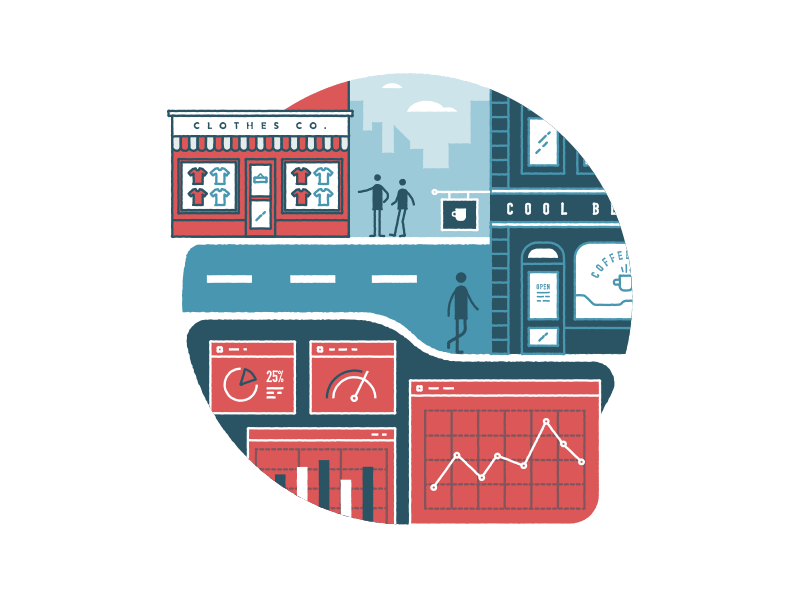
Vistar Media are an advertising platform that enables their clients to target customers in specific locations on mobile devices, digital screens as well traditional billboards and posters, a relatively complex topic to explain. I decided to use illustration to explain at a high-level, the technical aspects of what Vistar does.
The process started by discussing overall goals for the site with the Vistar team and then sketching up initial ideas to make sure that the content of each illustration was the correct visual metaphor for each of the topics on the site.
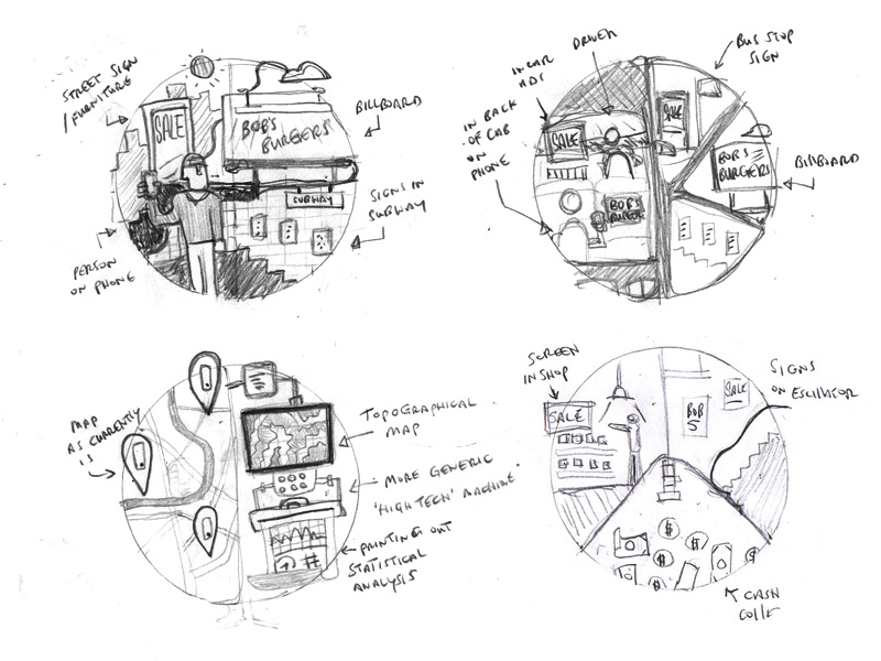 I usually start by creating rough sketches to make sure the content of the illustration is correct.
There was a lot of back and forth at this stage, making sure that the chosen visual metaphor lined up with the point that Vistar wanted to make about their service. I then created each illustration, making sure to keep consistency throughout in terms of stroke weight, size, effects and the types of shapes used. I wanted them to all feel unique, but part of the same set. I worked on web page layouts in tandem while creating these assets, to make sure the pages balanced well alongside the detailed illustration.
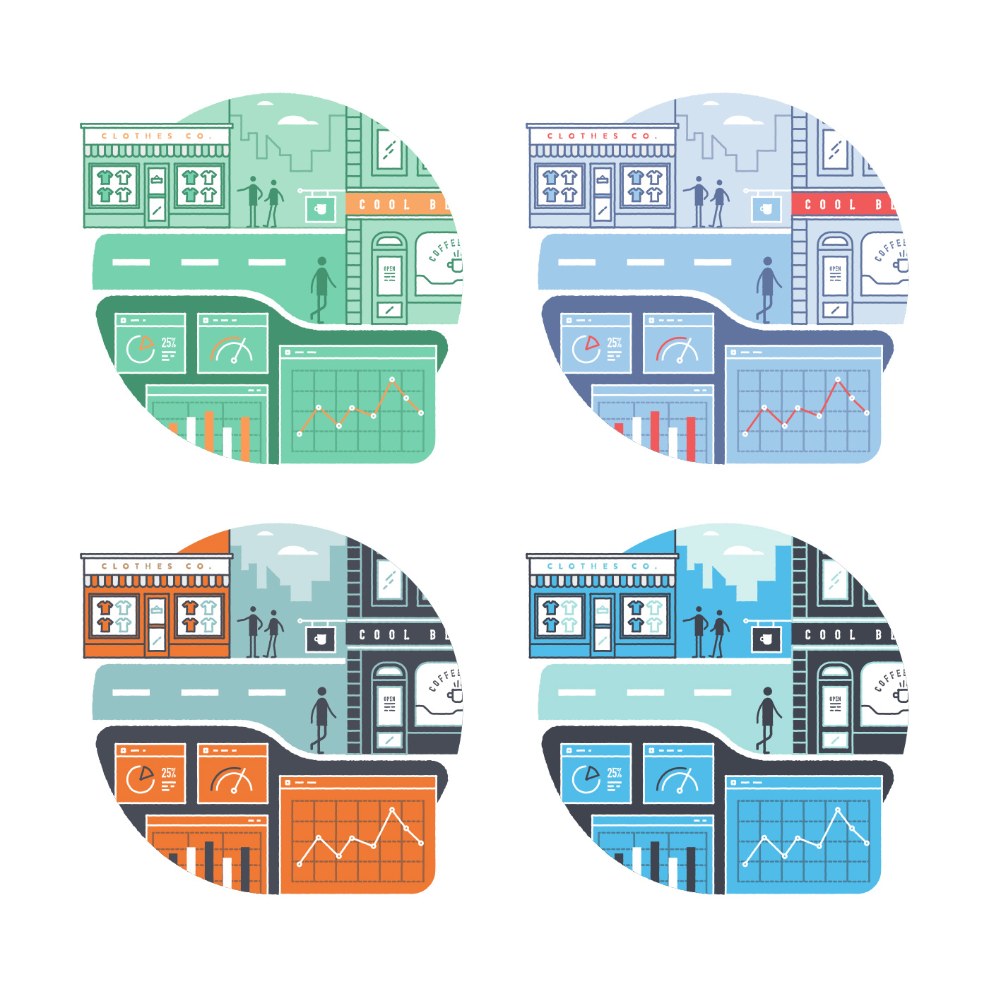
Unusually, the final colour scheme for this project wasn't finalised until the very end, I experimented with various schemes throughout, and in the end the Vistar team settled on using red with tones of blue and white. I personally feel that some of the options below are perhaps more original and could be used to setup a more unique overall brand look and feel. But, I totally understand their final choice, they didn't want something that would be too challenging or different from their current style.
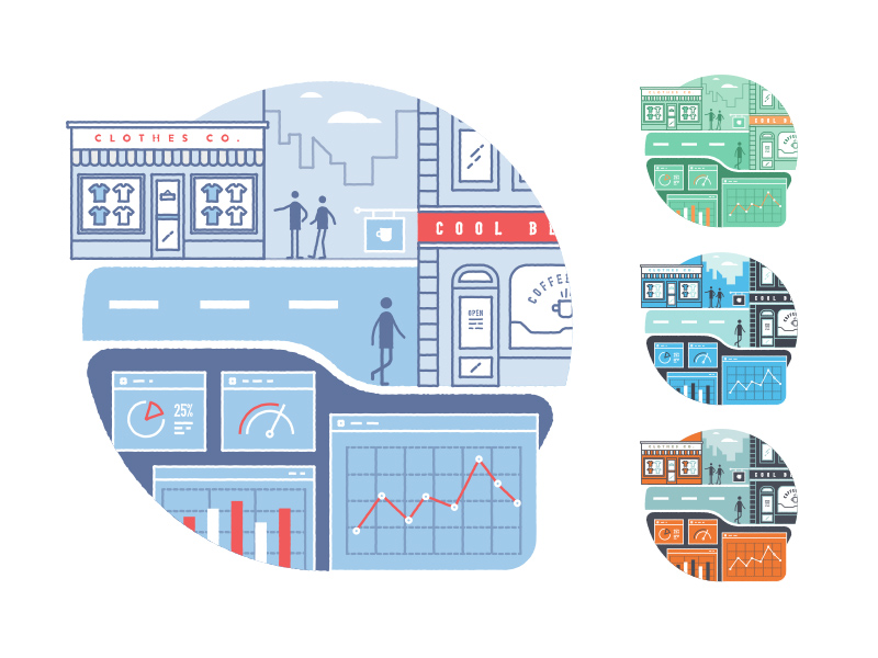 Colour palette experiments. See them larger here.
I'm really happy with how the illustration works with the final website layout and typography to tell Vistar's story.
It's opportunities to work on combinations of colour, type, illustration and layout like this, that are continually exciting to me.
You can see more screens from this project in my portfolio.