Branding Ambie
I worked with ambient music service Ambie, on a new company logo and visual look and feel.
Ambie provide music for all kinds of different spaces, from salons and shops, to juice bars and restaurants. Their music not only sets the tone, but creates an environment for businesses and their clientele.
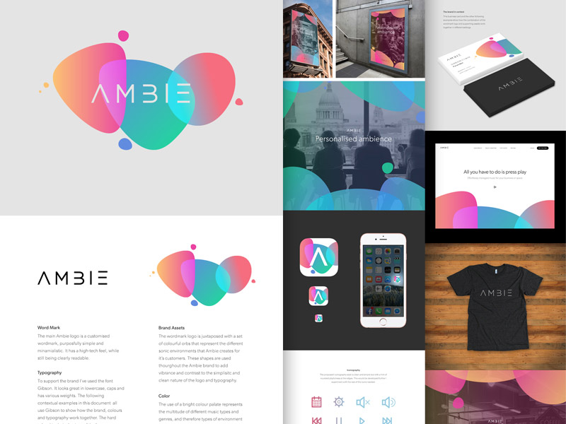
My initial idea for the new Ambie brand was to use 'orbs' of colour to represent the different sonic environments Ambie creates, with each colour also representing a different genre of music. I paired this with a 'high-tech' feeling word mark, a combination that together aimed to create a union of the more playful supporting assets with a more clean cut logo.
 My first pass at branding for Ambie.
We eventually went in a different direction, but I was really happy with the way this came out as an overall concept and package. Even though it didn't get used, sometimes it's necessary to play out different routes in order to get to the right one.
I like to show logo ideas in context (on a t-shirt, business card, mock home page etc) as it helps to show the full potential of what the brand could look like in the end. These are only initial ideas really, careful consideration would need to be given to each of the separate areas of course, but these early visualisations can be helpful for both the client and me.
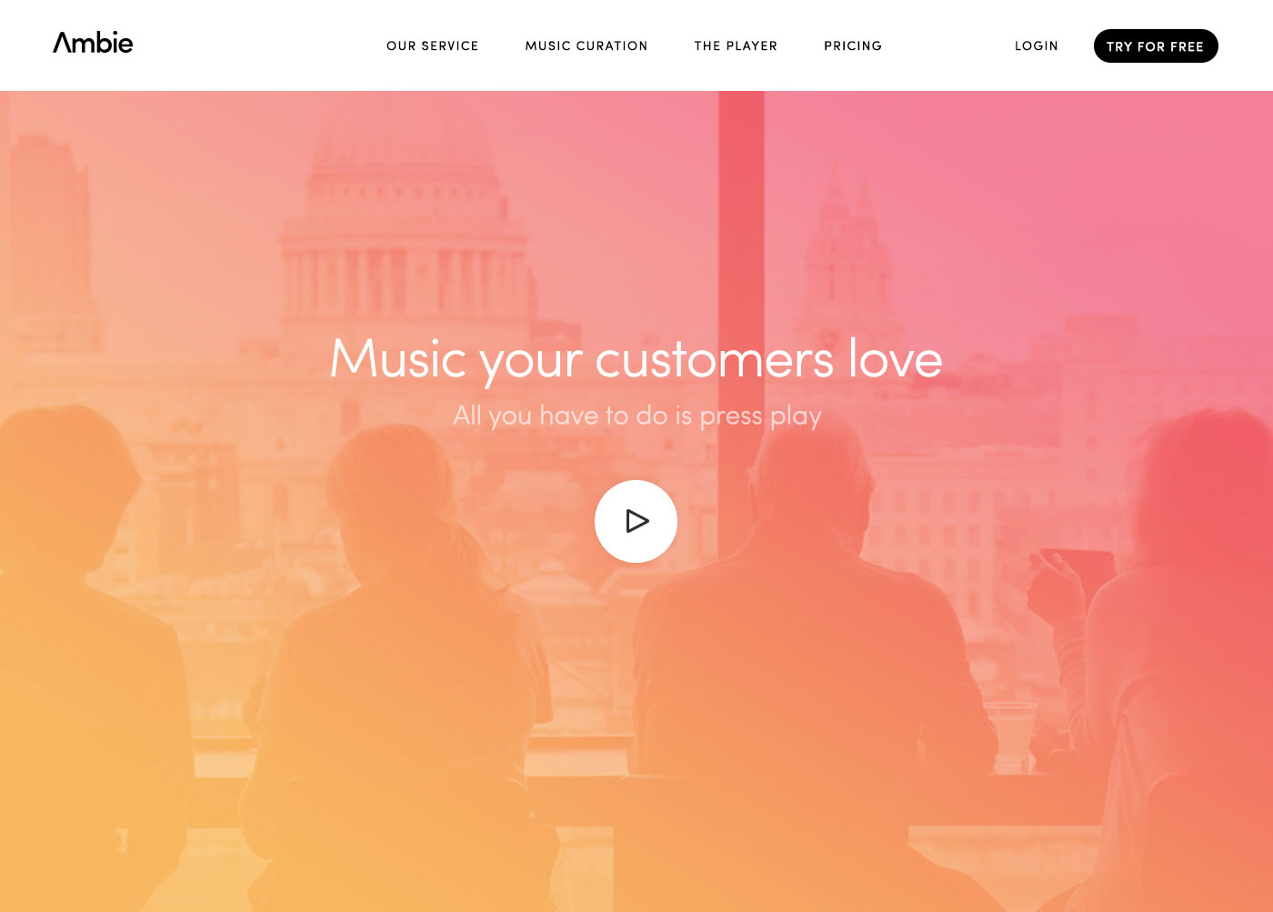 The brand in context.
The final direction for the brand again uses the idea of gradients to represent the different ambiences that Ambie creates for it's customers, but removes the constraint of 'orbs'. Any of the colours can be selected and used as a colourful gradient overlay for photography, or anything to do with visual marketing. Generally I try to stick to a limited colour palette, I just feel it creates something more memorable and lasting, stripping back the number of colours always seems to have a 'tightening' effect on any piece of work.
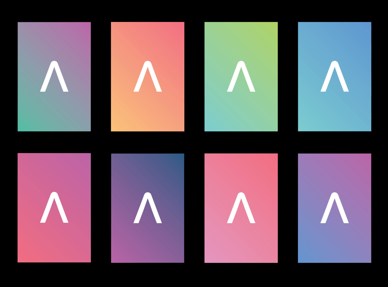 Colourful gradients represent sonic environments.
In this case though, multiple bright combinations of colour makes total sense for the brand, representing all of the many combinations of styles of music that Ambie can create.
The final word mark moves away from the more high-tech feel of the original option, to something slightly more friendly, but still with a streamlined clean feel. Hopefully this achieves the best of both worlds, professional, competent, trustworthy, modern but not overly technical, friendly but not too playful. The 'A' in Ambie can also be used as a mark on it's own, perhaps for avatars or anywhere that a smaller logo is needed.
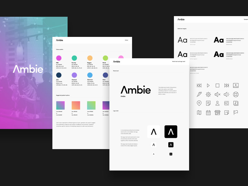 Ambie brand guidelines.
As part of the branding process I also created icons for use on the Ambie in store apps. Ambie supplies music to venues through it's suite of apps for iPad, iPhone and other devices.
 Ambie iconography.
Ideally I would always create an illustration or iconography style like this as part of a branding project. Although the final logo is very important, in the end it's everything else that the company does that defines how it looks and is remembered. Being able to create assets like this helps toward the goal of creating a clear message and overall look and feel that represents the company.