Designing Timber.io
I worked with New York based startup Timber.io, on new branding, marketing website, illustration and animation.
Timber make the traditionally difficult task of monitoring data logs easy, with their new interface that streamlines and modernises the whole process. Logs flood into the UI and unlike anything else currently on the market, Timber allows users to easily search, filter, spot trends and even click on individual logs to gain insight in a way that until now, wasn't possible with traditional data logging.
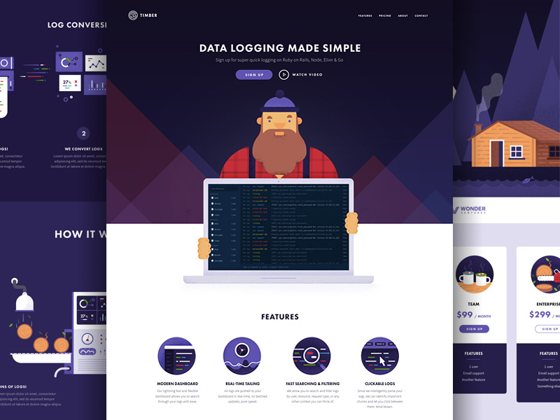 Final web designs
Timber wanted me to create a visual style for the company that injects a bit of fun into what could otherwise be a relatively dry subject matter, something that appeals to developers (the main users of a product like this) but also would be memorable to any casual viewer.
Look and feel
The process started with discussion around the overall visual route to take, during these early stages the final company name wasn't yet 100% settled upon, so we decided to explore two main routes.
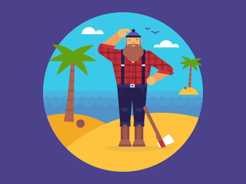
The first being around the name Timber, running with the visual metaphor of logs, trees and all things Lumberjack related. The second route was to go with a Viking theme, again hinting at the connection between the use of logs, perhaps to make boats and houses, but with the main difference being the use of a Viking mascot.
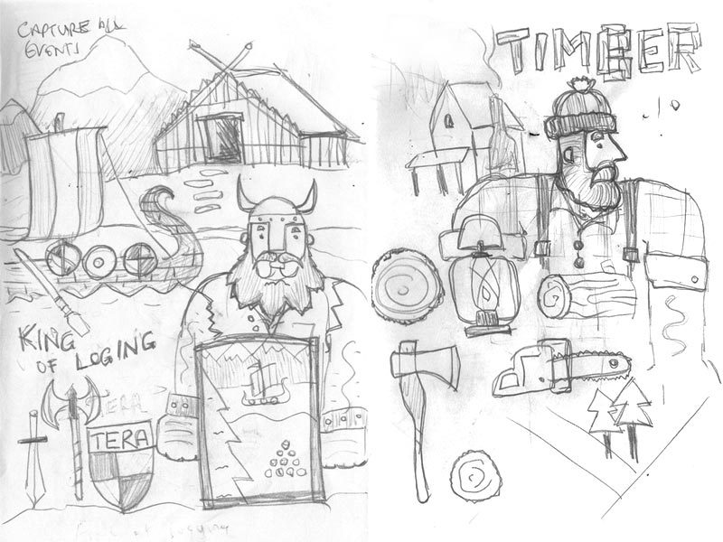 Initial sketches
I started out by simply sketching some really rough ideas to help us envisage what both routes might look like and then fleshed these out into full visuals.
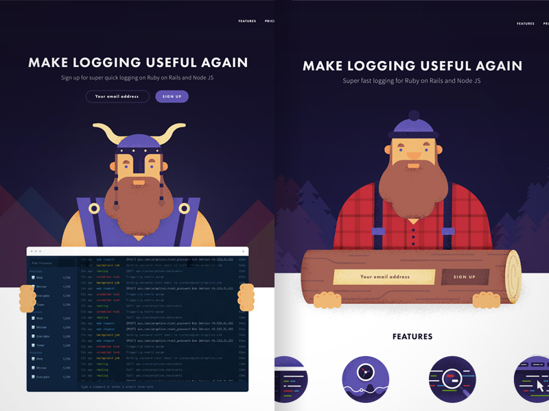 Comparing Vikings with Lumberjacks
At this point it became clear that the Lumberjack route resonated more with people we had shown the work to. It's just more of a direct connection, the almost pun-like quality of linking data logs, with wooden logs just works. It was less of a stretch for viewers of the site.
Branding
For the Timber logo I created something simple that hints at the idea of data as well as the visual metaphor around the name itself. This ended up being the letter T in the centre of a log, the lines around it creating tree rings, but also the general idea of 'strings of data'.
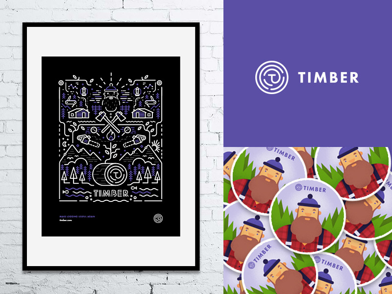
This then led onto a poster and t-shirt design, that supports the overall brand. It's a slightly different style to the main website graphics, but feels like it's part of the same family. Hopefully, everything comes together to create a look and feel for the company that is modern and trustworthy, but with a hint of fun that makes it memorable.
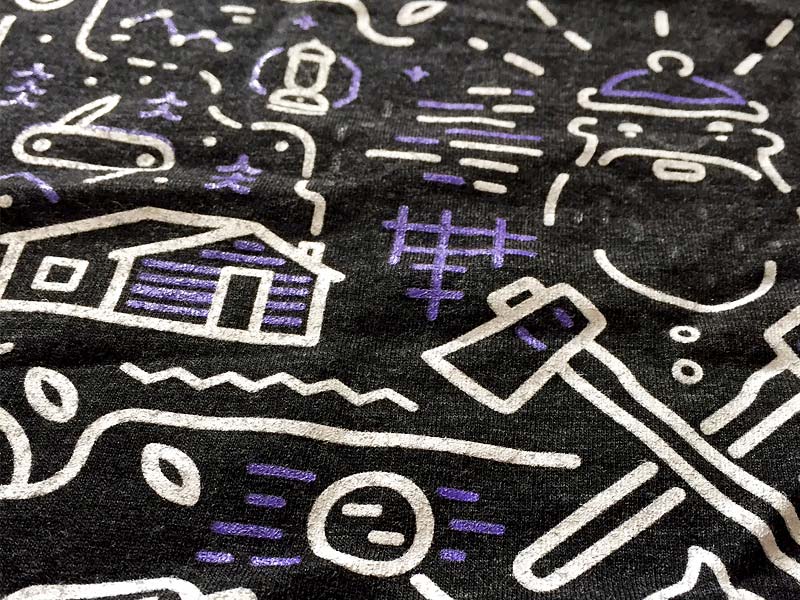 T-shirt design close up
Animation
To get across some of the high-level ideas behind what Timber does, I created some simple animation to be used in various places on the website, but mainly via a 'how it works' type of graphic.
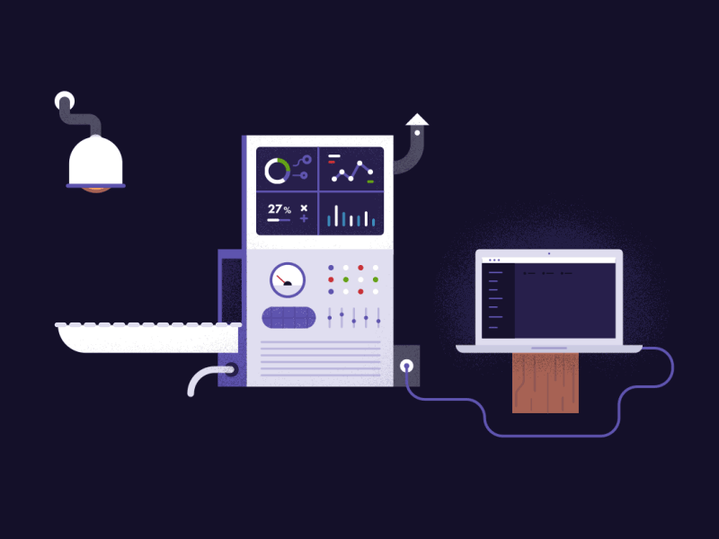 How it works animation
Again running with the trees / logging visual metaphor, I came up with the idea of combining 'real life' logs with data logs, in a kind of logging conveyor-belt machine. This continually looping gif communicates the idea that a never-ending number of logs are fed in, the hard work is done by the Timber machine in the middle, and the end result is a clean and clear user interface at the end.
I also created a simple looping gif for a 'coming soon' holding page.

And a bit of fun for the 404 page, where our Lumberjack mascot find himself (like the user) in the wrong place.
The final outcome of this project is a set of work that I am very proud of. I'm extremely grateful to the team at Timber for allowing me to run with my ideas. In doing so have hopefully come up with something memorable that is a little different from the norm.
You can see a few more screens from this work in my main portfolio, if you have project that you think I could help with, please get in touch.