Designing Mibex
I worked with Zurich based software development agency Mibex, on new branding, marketing website design and illustration. Mibex build development tools for Atlassian products, with the aim of improving workflows, helping to cut time-consuming corners and generally aid developers to work more efficiently.
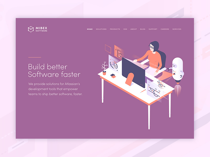 Mibex home page
The Brief
Mibex wanted me to create a technical and reliable overall look and feel, but also include an element of fun and friendliness. We started by discussing what their main goal and objective is as a company, it quickly became obvious that at their core, Mibex create software to help developers. To be at the developers side while they work, making difficult tasks simple, quick and generally improving workflow.
Using illustration
As I've said before, I love projects where illustration can take centre stage. For me, the thing that can make a brand stand out most, even more so than the company logo, colour scheme, or typography choices (which are all important too, of course) are the visual assets used on the companies website. And, in this case Mibex were very keen to use illustration to explain and visualise what they do in a 'high-level' way.
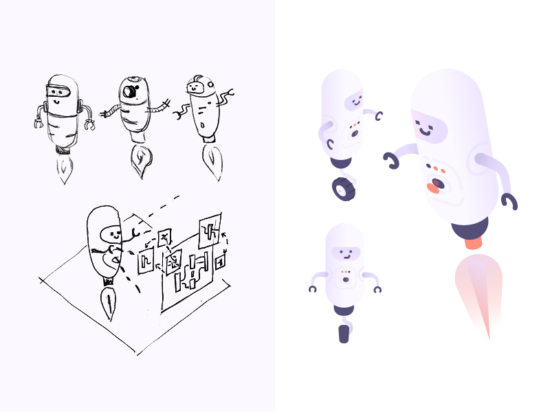 Initial sketches vs final robot illustration
As an overall theme, we decided to go with the visual metaphor of a 'helper robot', to literally be at the side of the developer, improving their work. I started with rough initial sketches of how the robot could look, simple and friendly, hovering or rolling around the illustrations.
The robot appears alongside developers in various situations, helping out with planning, reviewing and automating code.
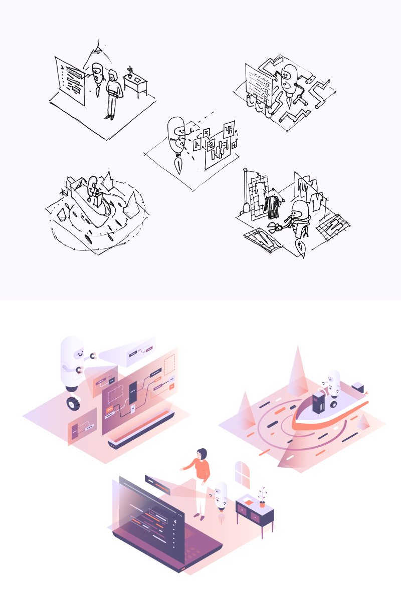 Initial add-on sketches vs final illustrations
Mibex build add-ons for Atlassian products like BitBucket and Bamboo, Sonar for Bitbucket Server and Plan DSL for Bamboo. Illustrating some of these add-ons called for the robot to be on a speed boat using sonar to find code, automating inside a computer, 'tailoring' repository templates and even navigating a 'jungle of code' Indiana Jones style!
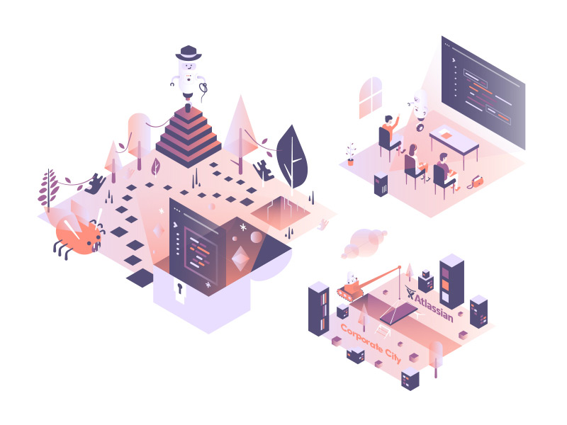 Final web designs
Website
The website needed to be a relatively simple set of marketing pages to explain Mibex's software solutions and services at a high-level, while linking off to their various add-ons on the Atlassian marketplace and the usual contact, careers information and blog.
I used different tones of the main branding colours of purple and orangery-red through the site, mixed with large areas of white space to hopefully create an easy to use, balanced and informative experience.
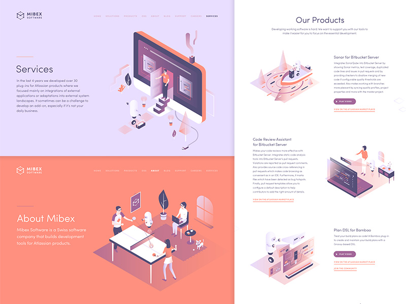 Mibex website page designs
Logo and Branding
Every project is different, but in this case I worked on the logo after the bulk of the illustration and web design work was in place. Sometimes I find that working in this way allows the company look and feel to evolve without being constrained by a pre-existing logo, set of colours or typography, that might not be based on the experience of working with companies actual 'content'. The logo can then be created with guidance from a body of work in place that is based concisely on what the company does and it's messaging.
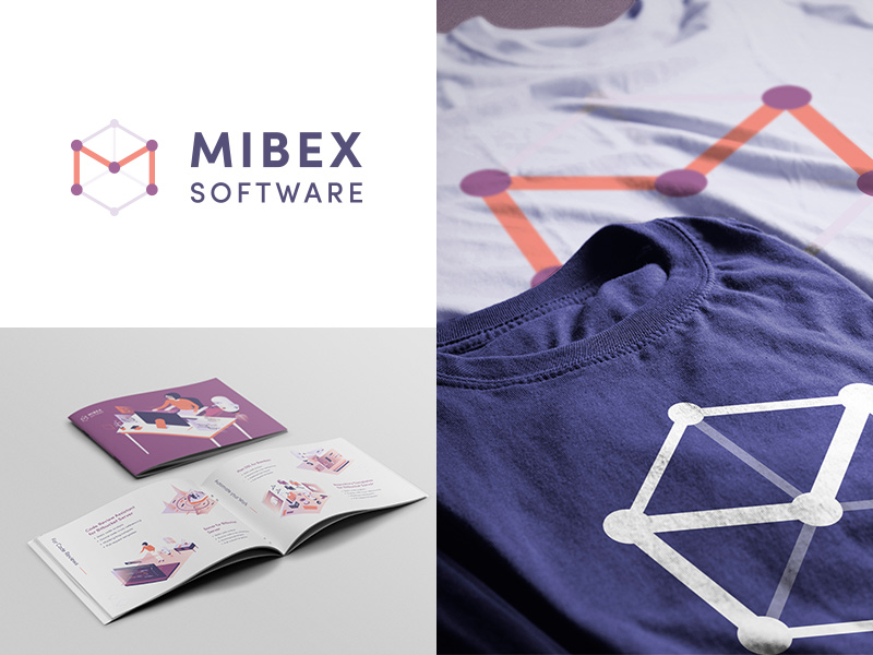 Mibex logo
That said, I then had the task of creating a logo to fit in with the look and feel of the site and illustrations. In this case Mibex wanted a simple 'M' mark, combined with 'nodes', associated with code repositories that their developer base use and understand. Style-wise the 3d effect cube reflects the look and feel of the isometric illustrations.
We then extended the branding to work across t-shirts, business cards, posters and an A5 brochure.
tttThe final outcome is a project that genuinely is one of my favourite ever to have worked on. You can see a few more screens from this work in my main portfolio, if you have project that you think I could help with, please get in touch.