Heroic Labds in .Net magazine
At the end of last year I was asked for my ideas on 'web trends for 2016', by the nice people at Net magazine. In March this year (issue 277) they printed the piece, which features along with my own, thoughts from 22 other designers and developers on trends for the year. (Also available online here.)

My contribution to the piece was around how I'd like to see more bespoke illustration being used online, from the article:
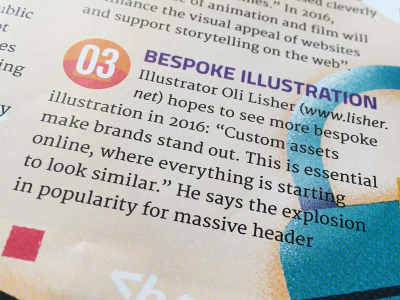
Illustrator Oli Lisher hopes to see more bespoke illustration in 2016: "Custom assets make brands stand out. This is essential online, where everything is starting to look similar."
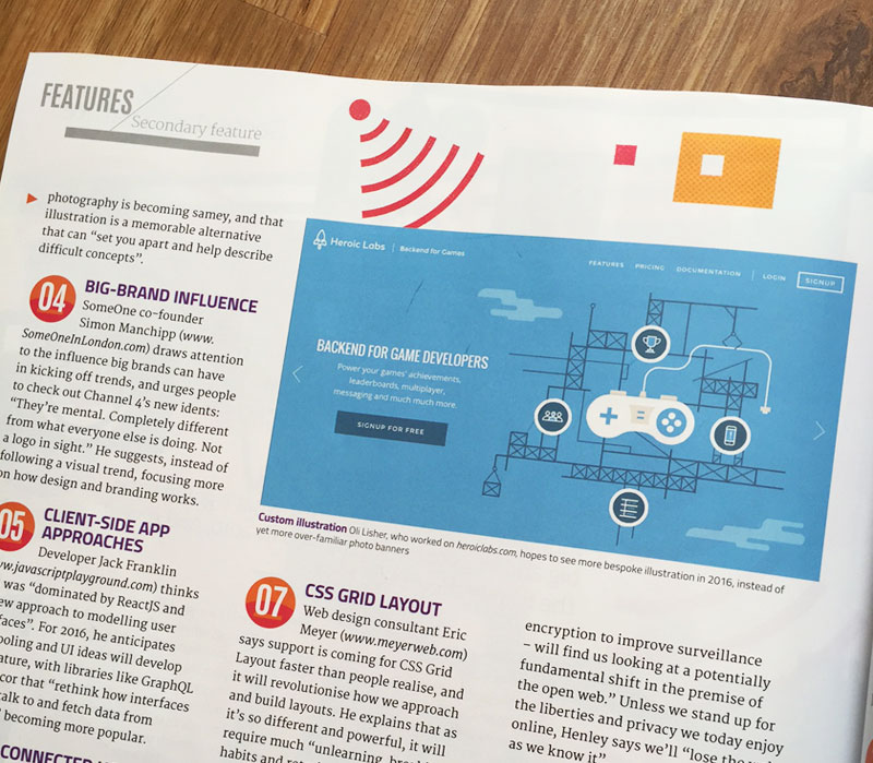
He says the explosion in popularity for massive header photography is becoming samey, and that illustration is a memorable alternative that can "set you apart and help describe difficult concepts".
They printed some of the design and illustration from my work with Heroic Labs as an example of the point I was making.
 My design work for Heroic Labs
To expand a little further, I feel the thing that makes a brand or company stand out most, even more so than the company logo, colour scheme, or typography choices (which are all important too, of course) are custom assets. Usually on the web, these assets come in the form of photography — in recent years we've seen an explosion in sites using large header photography, making everything start to feel a bit familiar.
Don't get me wrong, I've used this technique myself and there will always be a place for great photography of course. And there is even the argument that this 'sameification' is a good thing, that the general public will start to see it as a pattern that they understand, like a style guide for the web almost.
But I'd argue that Illustration can set you apart, help to describe difficult concepts at a high-level and makes a memorable alternative to photography.