Halloween poster
Halloween is my favourite time of year, I decided to work on a poster to celebrate that fact. Here is a quick overview of the process.

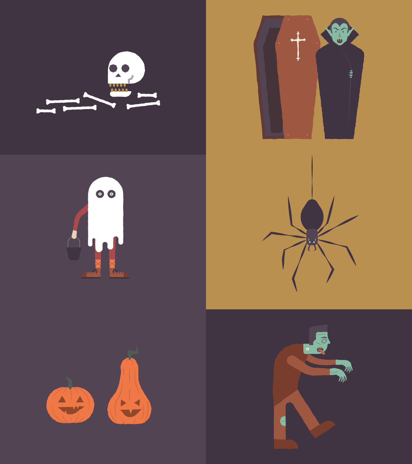
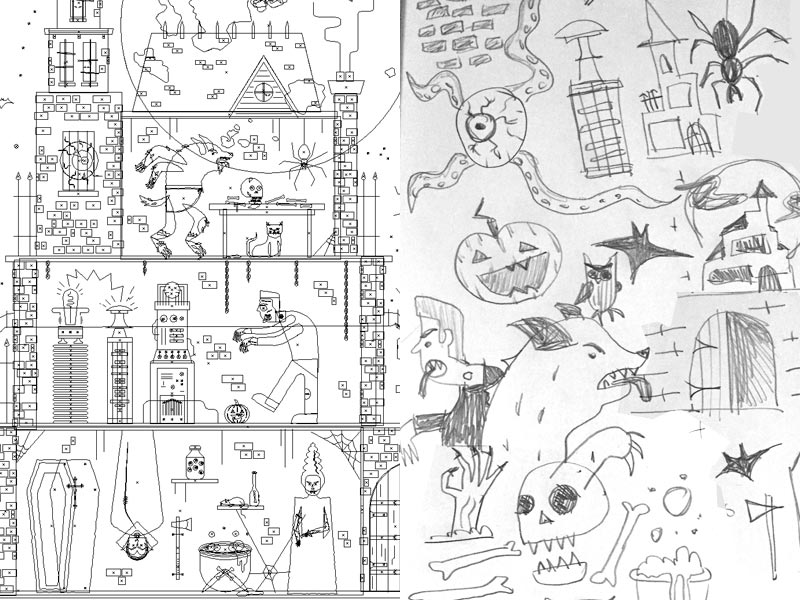
I started by sketching out various classic Halloween characters and themes. Pumpkins, spiders, Dracula, Frankenstein, haunted houses etc. I wanted to include as many different spooky halloween themed items as possible.

Then, before thinking too hard about any kind of arrangement or layout I jumped into working on the different assets to go in the poster. I always find this is the best route with any project like this, you can become overwhelmed with the overall idea, so focusing on a small starting place can really help.
In this case it was the scary looking owl that I tackled first. I setup a palette of colours and some general rules about the type of shapes I would use for the rest of the illustration.
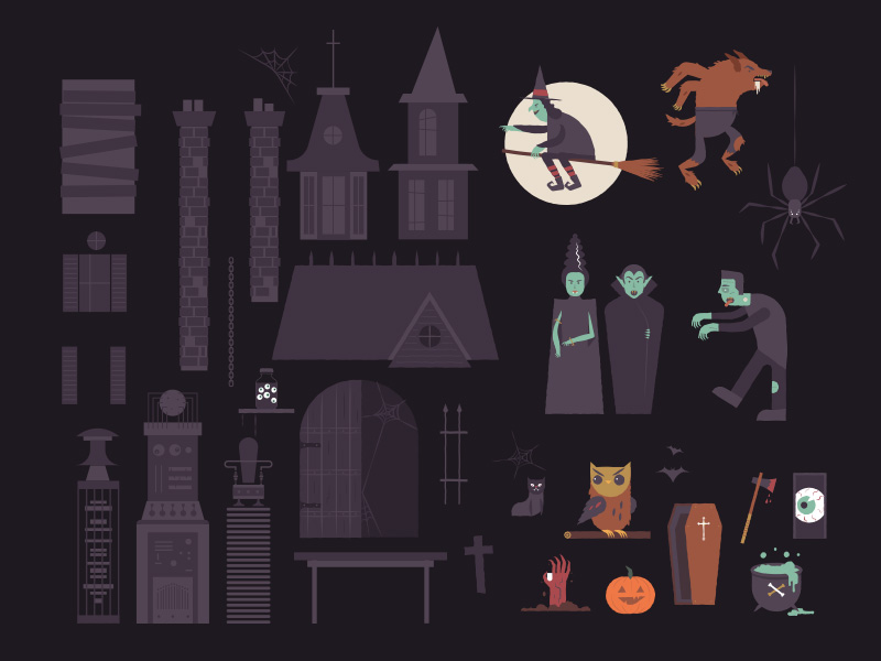
 The first step was to create lots of assets.
I then went on to work on each element in further detail and iterate on various layout ideas. The final one being a haunted house with different layers containing all of the Halloween characters and objects.
The last step in the process was to work on shading, I think it adds to the overall feeling of spookiness. The image below shows a section of the poster with and without shading.
 With and without shading.
This effect is created really simply, using the dissolve mode with a feathered edged paint brush in Photoshop. Liberally adding dark areas to the corners of rooms and places that I imagine shadows might fall helps to add a little bit of extra depth.
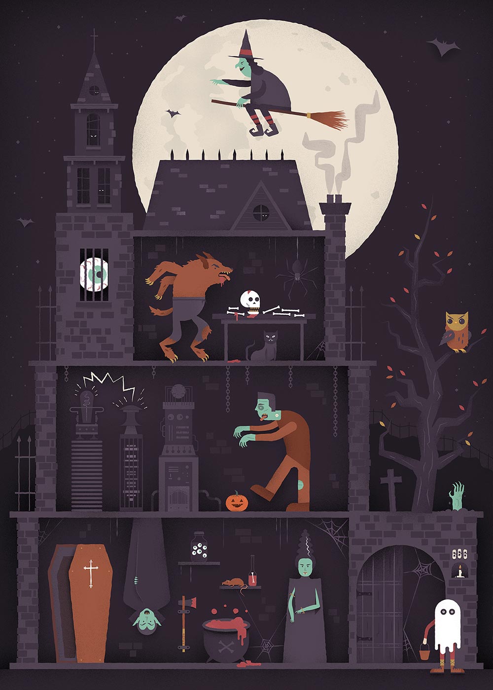
I'm really happy with the final outcome, it was great fun experimenting with a slightly different style to normal. Check out the final image below or view it full size here.
 Final Halloween poster.