Designing for Demuxed conference
For the past 6 years I’ve worked with the amazing people at Demuxed on their branding, marketing design and website. Demuxed is a San Francisco based conference for video engineers. Attendees work on some of the best video products on the web, with great speakers from the likes of Netflix, Google and YouTube.
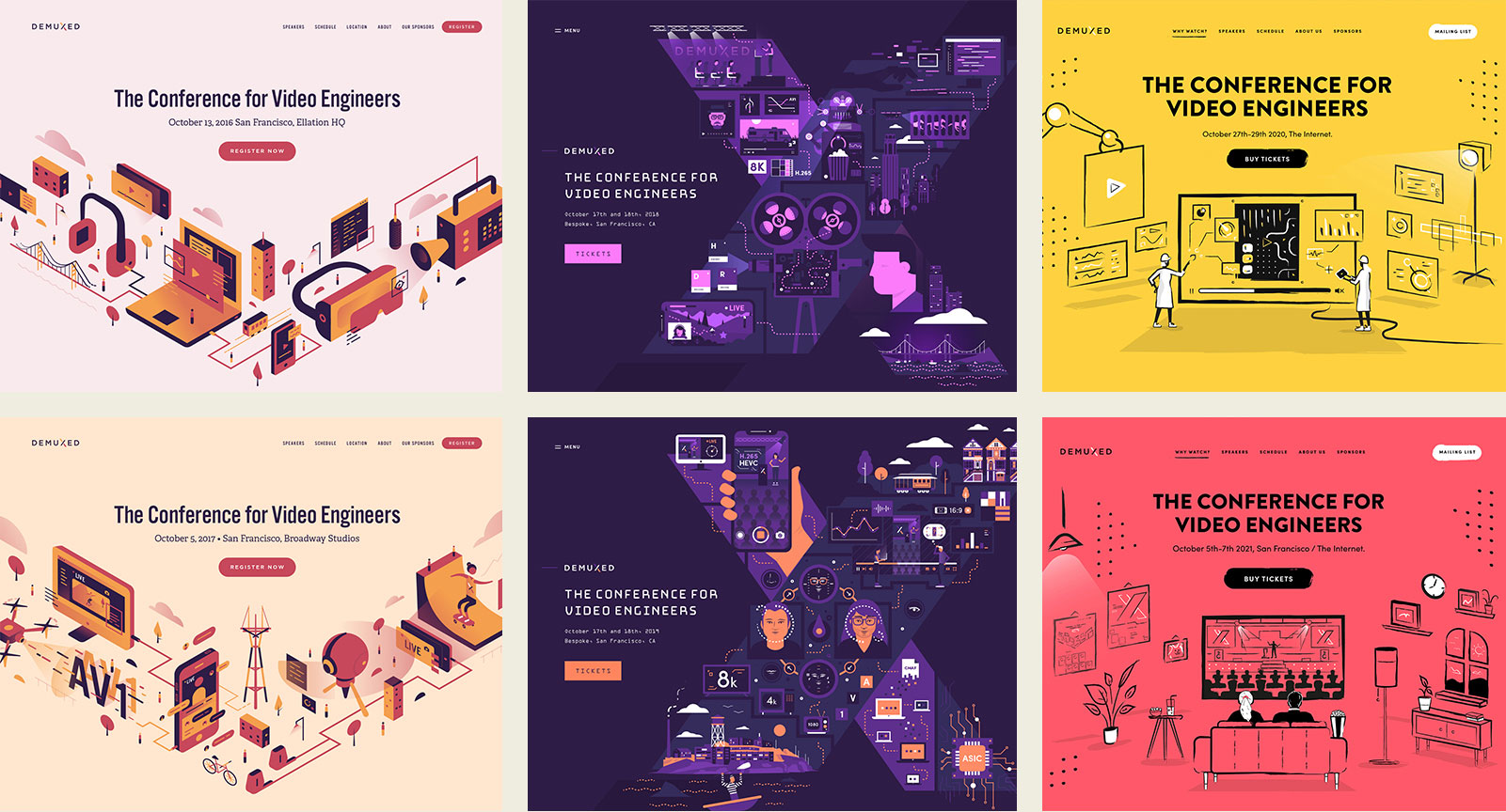 Demuxed design 2016 - 2021
To get the most mileage from each design we reuse the same look and feel across a two year cycle, updating main accent colours, illustration and conference details, but keeping the core design.
2016 - 2017
For the first redesign (of what started as a casual meet-up that would grow into a full conference) in 2016 - 2017 we went for an isometric illustrated city-scape theme. With the aim of representing different aspects of video engineering, from cameras to code. This concept also acts as an overall visual metaphor for the conference, with mini illustrated attendees exploring and references to the venue and location.
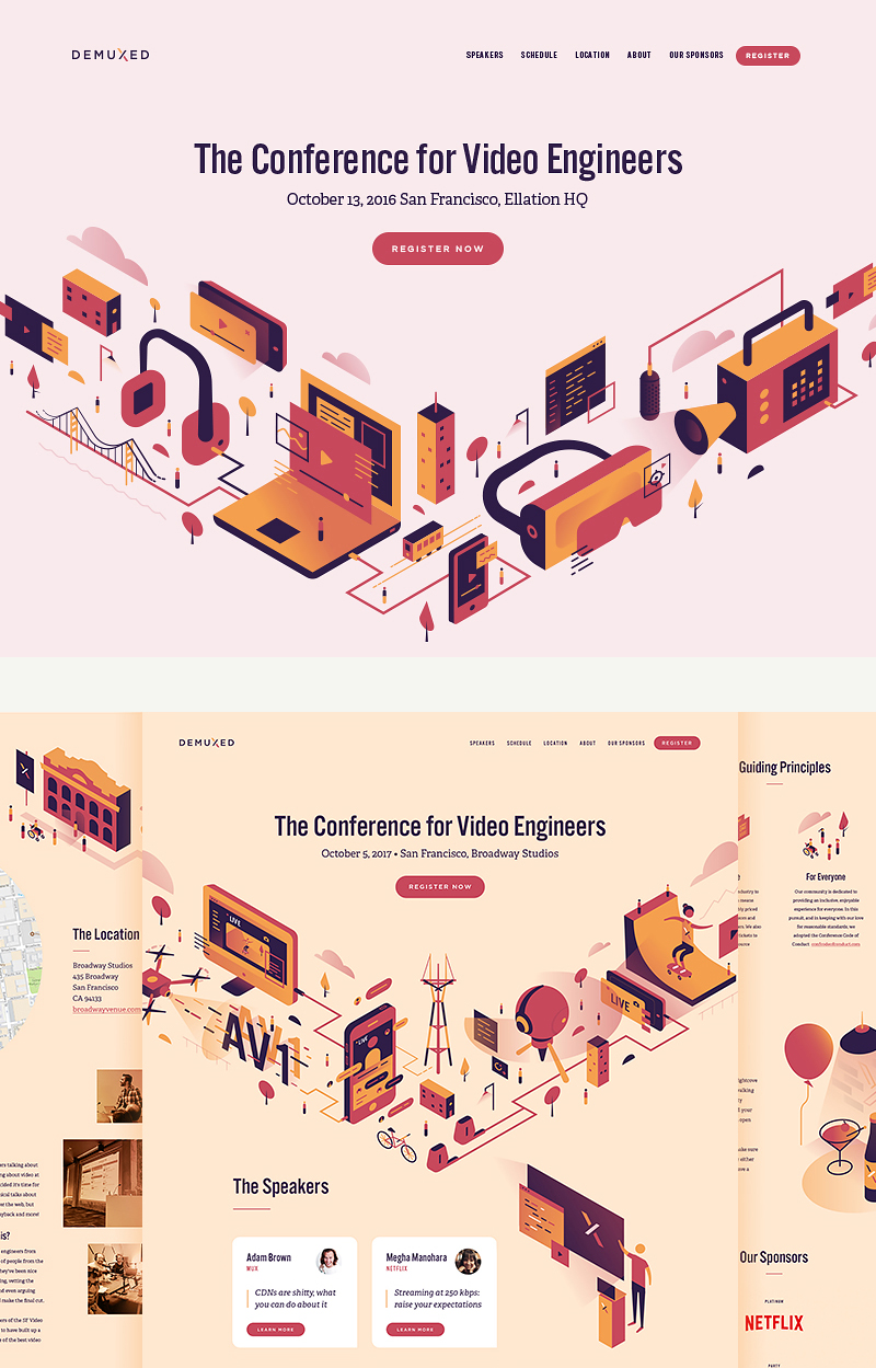 Demuxed design 2016 - 2017
The site is always purposely simple and streamlined, with the aim of getting across speaker, schedule and location information in an easily digestible way. One of the points from the original brief was to make sure the design looked nothing like the typical marketing focused ‘standard’ designs of rival conference sites, something I hope we’ve continued to achieve over the years.
2018 -2019
For the 2018 - 19 versions we wanted to reflect Demuxed’s growth in the previous three years. What started as small meet-up for local developers, had now become a two day event at a large top-spec venue. As usual we focused on new illustration, but this time had a much larger schedule and bigger roster of speakers. We also had access to lots of great new photography from the previous two years.
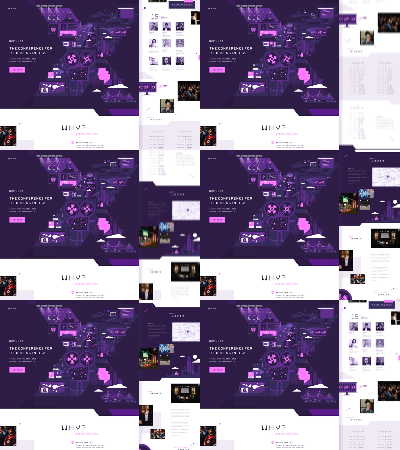 Demuxed design 2018
I had great fun animating the hero illustrations that included trending topics for video engineers at the time, from HDR colour and 8k screens, to AI watching video. (Hence the binge watching robot!).
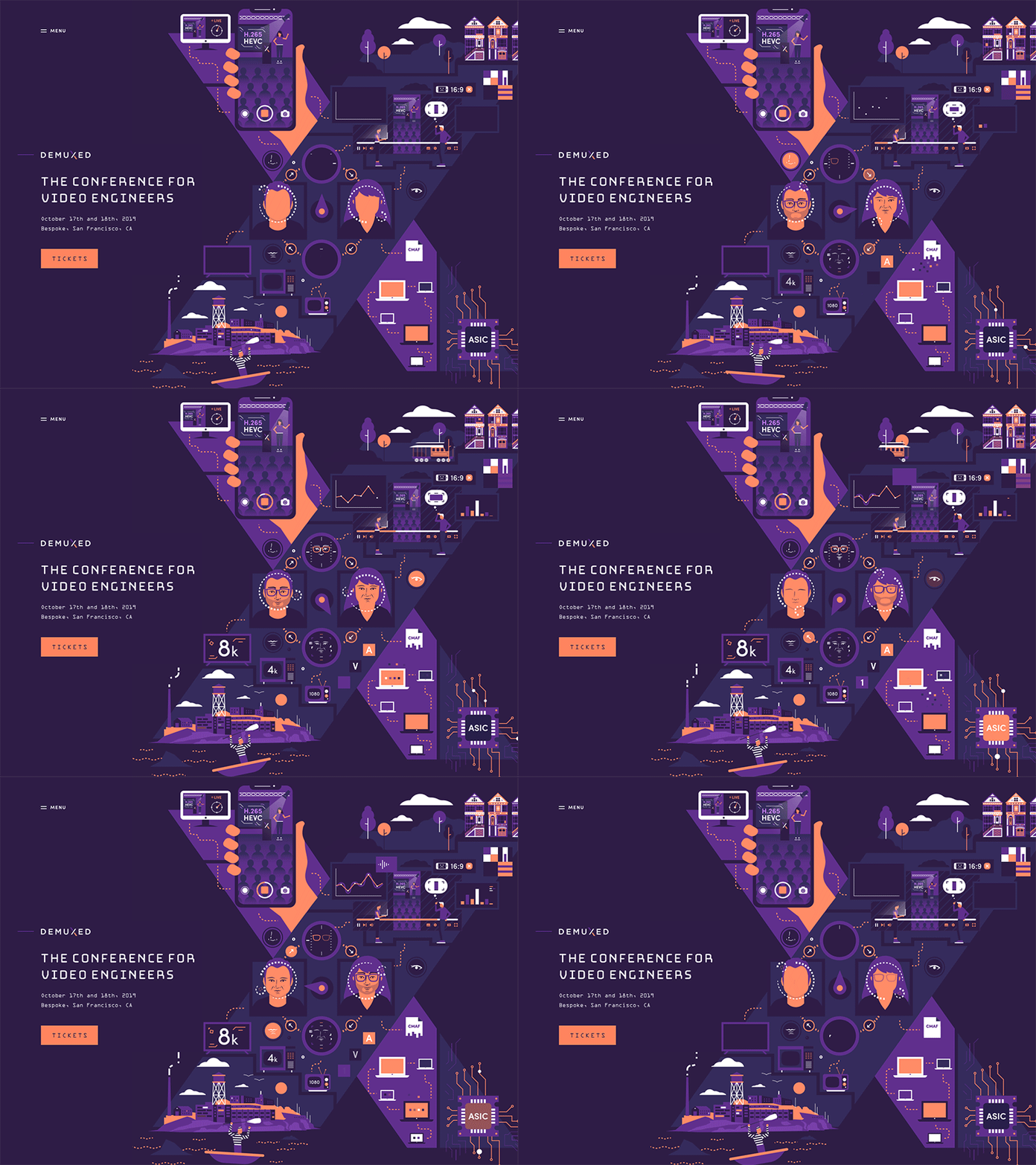 Demuxed design 2019
The 2019 update focused on everything to do with video on-line, from live streaming to ‘deepfake face swaps’. Mixed in with San Francisco landmarks like The Painted Ladies (famous colorful row of housing) and Alcatraz.
2020 -2021
In 2020 we went for a fresh hand drawn illustration style and single bright accent colour. With the 2021 version in particular highlighting the ‘hybrid’ nature of the conference, being partly an in person and partly on-line event — unfortunately COVID meant in the end it was 100% on-line year.
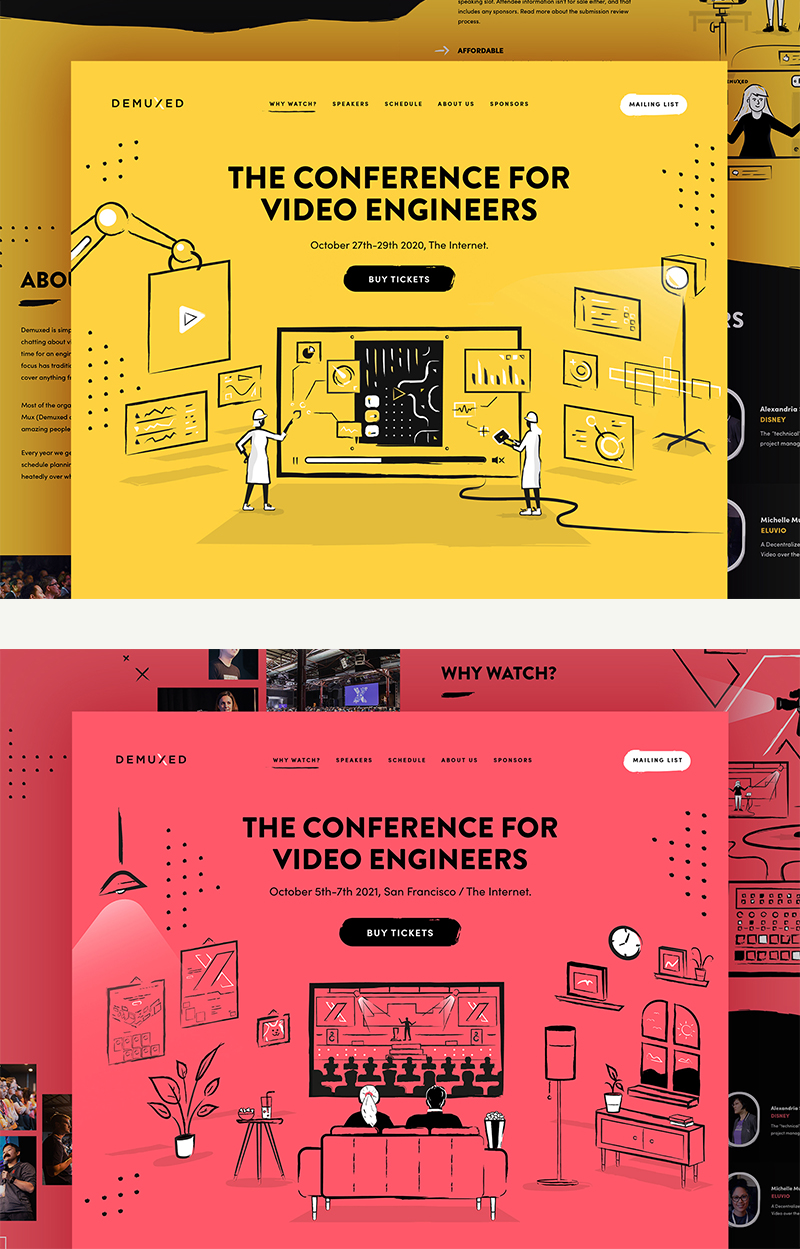 Demuxed design 2020 - 2021
The other main change was updating the accent colour to a striking coral, which was a nice contrast to the previous year’s bright yellow.
2022
The new 2022 site has just gone live, it features a 3d illustration style with fun cartoon-ish characters and background elements. I've really enjoyed working more with 3d in recent years, and this design was certainly a challenge. I created various characters in scenarios that would resonate with video developers.
 Demuxed 2022 website
The core concept of this year's design comes from a sketch the Demuxed team had worked on internally of a fun 'TV person' character. I recreated this in 3d, and as the design progressed worked on a cast of other characters in situations that would resonate with video developers.
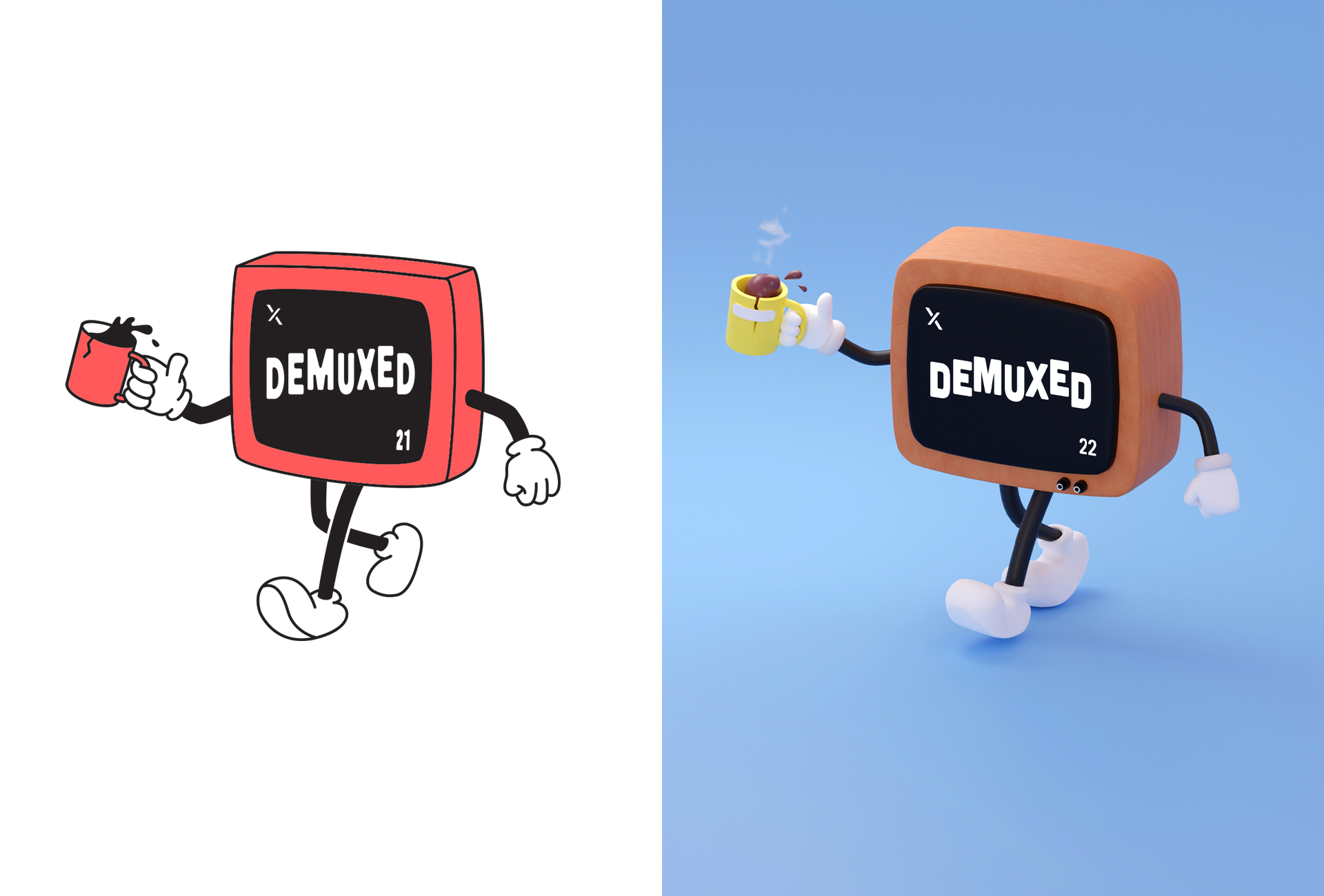 Original TV person sketch and full 3d
I feel very fortunate to be able to work on new styles and approaches to the conference each year. Dexmued are fantastic to work with, letting me run with creative concepts I feel passionate about. Over the past six years I’ve designed swag, printed flyers, banners, video stream UI, animated stings and even music, all for the conf. More to come soon!
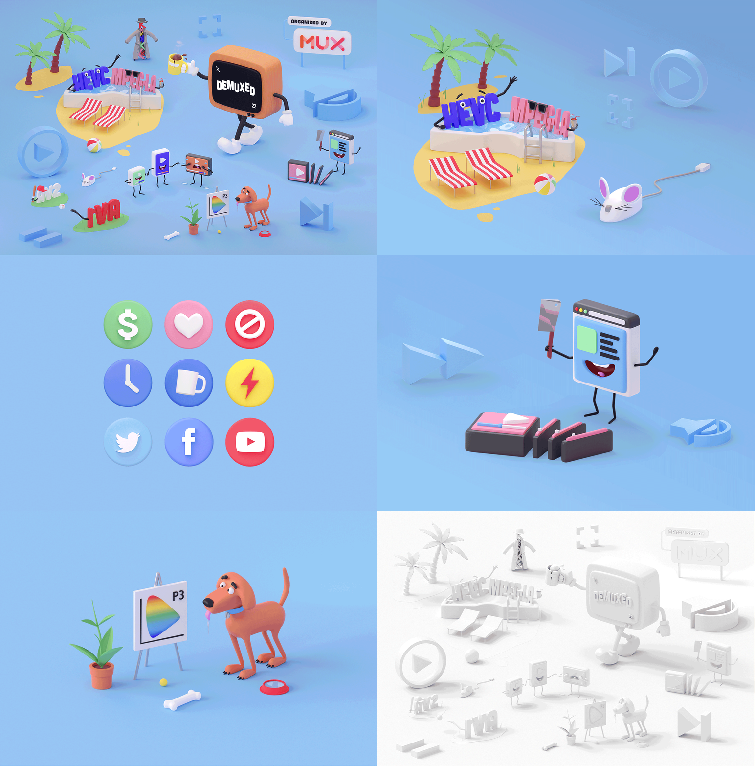 Demuxed 2022 3d illustrations