Chichester Design
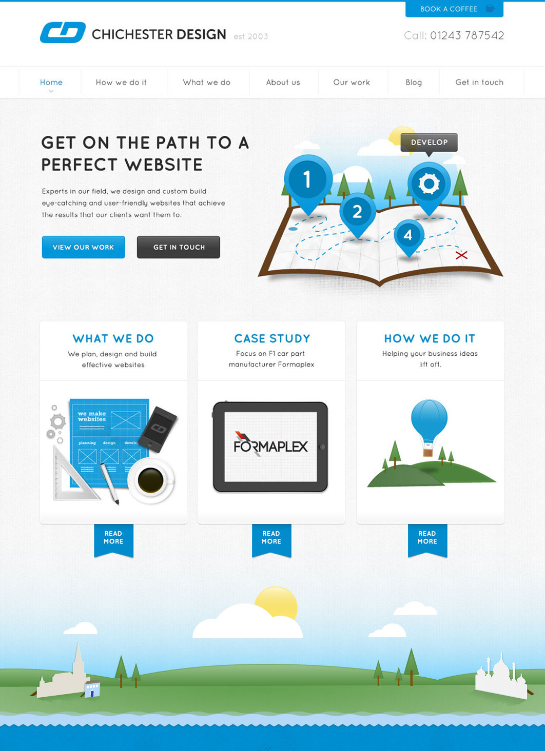
About this time last year I finished up the re-design for UK based design agency, Chichester Design. It's great to see that the site is now live, and the guys (in particular Ashley Stevens on front-end) did a great job developing it, especially making it responsive.

After much discussion about the tone of the site, the message it needed to get across, we came up with a plan of action and content strategy. The main idea behind the re-design was to modernise the site, keeping it professional, but at the same time friendly and approachable to businesses in the local area.
Building around the main strap line of "Get on the path to a perfect website", I was able to create a map illustration that set the tone for the rest of the visual look and feel for the site.
 Map illustration
I then created a series of illustrations that represent the services Chichester Design provide, as well as representing aspects of the surrounding area. The style for the rest of the site then followed on from this, I find it really useful when possible to create assets for the design first, before even thinking about possible layouts or even typography. It's an approach I have used more and more. You can see more screens from this project in my portfolio.
It's interesting that even though the site was first designed a year ago now, I think it still stands up today design-wise, for what it is and is supposed to achieve. I think it's because of all the ground work that was put in early on, making sure the tone of the copy and then visuals was on target for the brief the team had.